 |
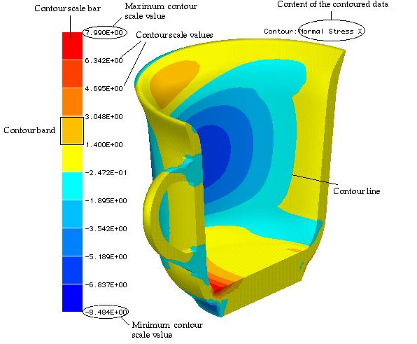
Contouring data is the most frequently used method of visualizing finite
element analysis results. This method is appropriate for visualizing the
distribution of scalar data, such as stress, strain or temperature, on
planes or surfaces. Each contour represents a continuous curve on which
the value of the scalar data is uniform. Thus, gradual variation of data
on the planes or surfaces is scaled by a number of contours. In order
to improve the visual effect, VisualFEA renders colored
contour bands instead of contour lines. The entire span
of the scalar value is divided into a number of sub-spans. Each sub-span
is re p resented by a contour band. The numerical values re p resented
by border lines of contour bands are indicated in the contour scale bar
which appears together with a contour image.
One weakness of contouring is its incapability of visualizing the data
distribution inside of 3 dimensional volume. Auxiliary
planes like cut plane, cross planes and parallel planes are used as volume
visualization aids to make up for this limitation.
|